
Fearless Ventures Foundation
A rebrand for a nonprofit that helps people with physical disabilities through fitness, travel, and community, plus a rallying cry graphic with a lightning bolt built from broken vertebrae.
- ForClient
- Fearless Ventures Foundation
- Role
- Brand Designer
- Year
- 2024
- Result
- A new identity on the foundation's vehicles, gear, events, and website
- Scope
The brief
Fearless Ventures Foundation is a nonprofit in Waco, Texas, started by Edwin Muñoz after a spinal cord injury in 2018. It helps people with physical disabilities cover rehab and equipment, travel, and train together. The original logo didn't carry the strength of the people it serves, and the foundation needed an identity that could hold up everywhere it shows up, from programs and fundraisers to its website.
The approach
I built the new mark from the initials. Two Fs face each other and lock around a center V, so F-V-F reads as one bold crest. Heavy condensed letters and a strict black and white palette keep it confident on a banner, a shirt, or a phone screen.
Where it started
The original logo: thin wings and a light typeface that faded at small sizes and didn't feel like the foundation's grit.

The new mark
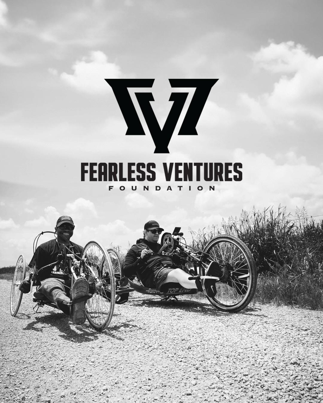
One symbol, a stacked logo, and a horizontal lockup, all in black and white.



From spine to bolt
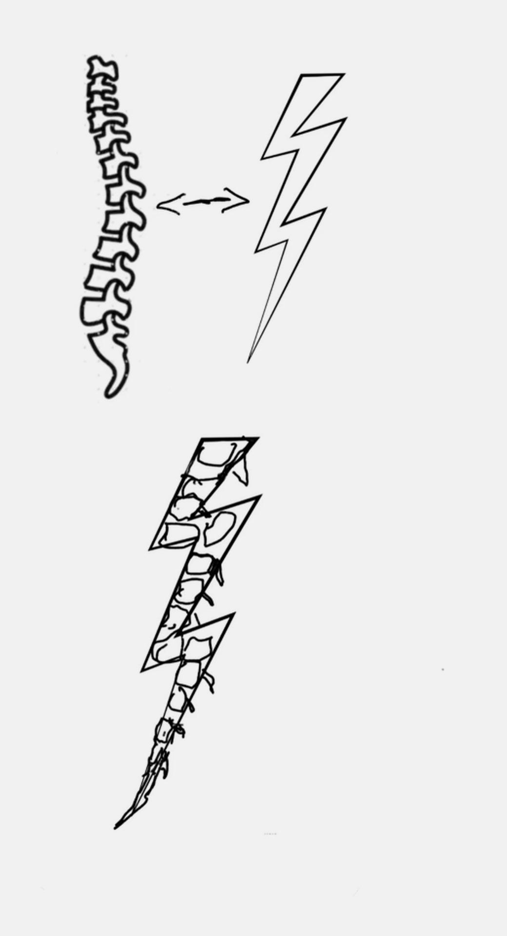
The foundation exists because of a spinal cord injury, so I wanted the graphic for its rallying cry to carry that story. I sketched a spine beside a lightning bolt, then rebuilt the bolt out of broken vertebrae: the injury that started it all, turned into the strike of energy that runs through everything the foundation does.

Charge the Storm
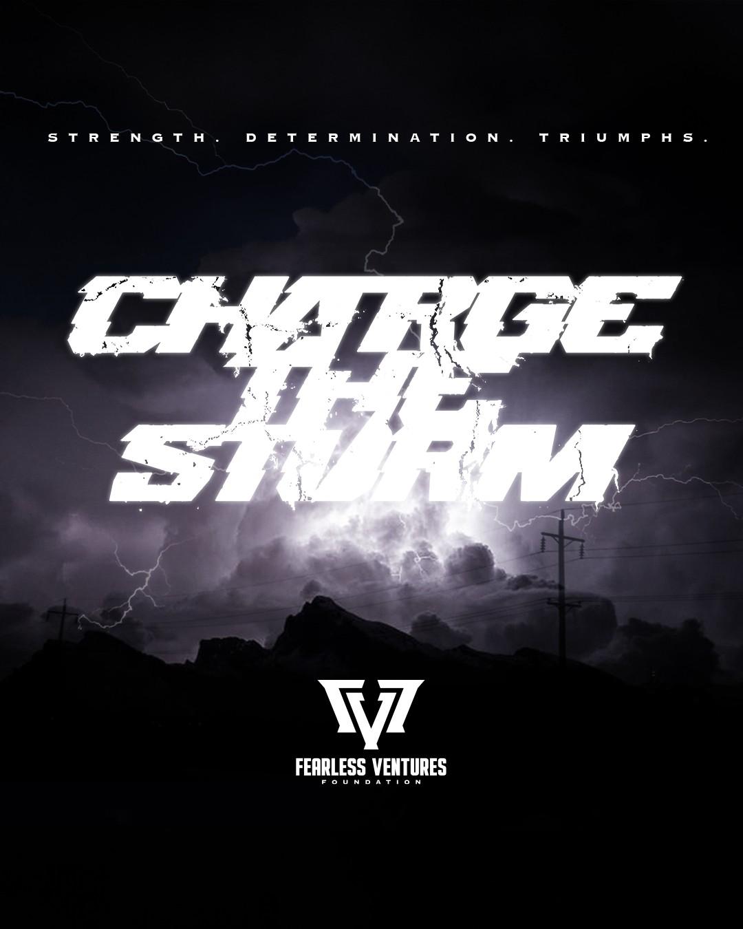
Charge the Storm is the foundation's rallying cry: charge into the unknown, the scary, the hard, and take the challenge head on. I lettered it to look struck by lightning, with the vertebrae bolt splitting the type, and it went on shirts and posters.

In use
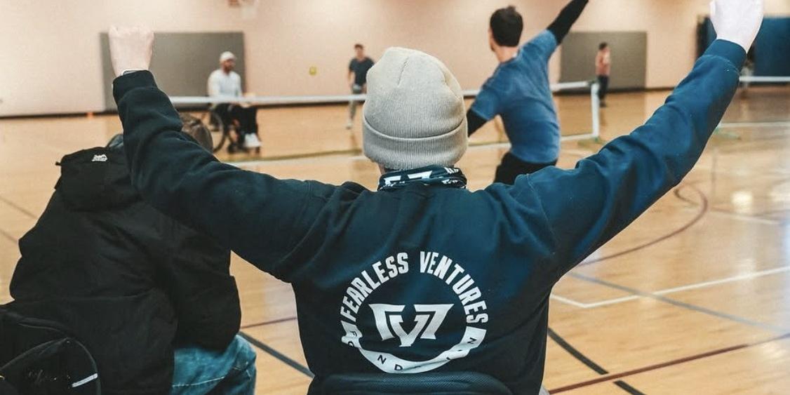
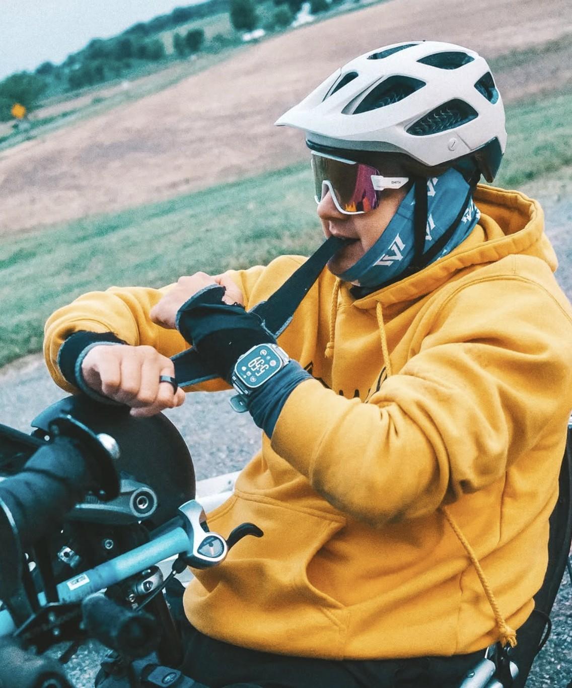
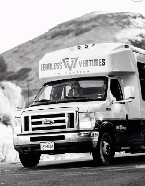
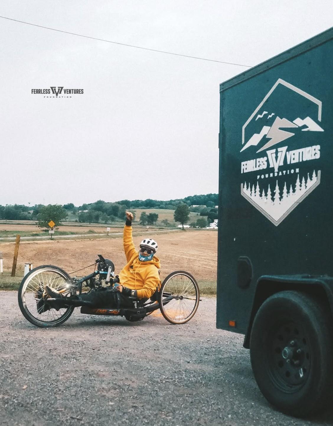
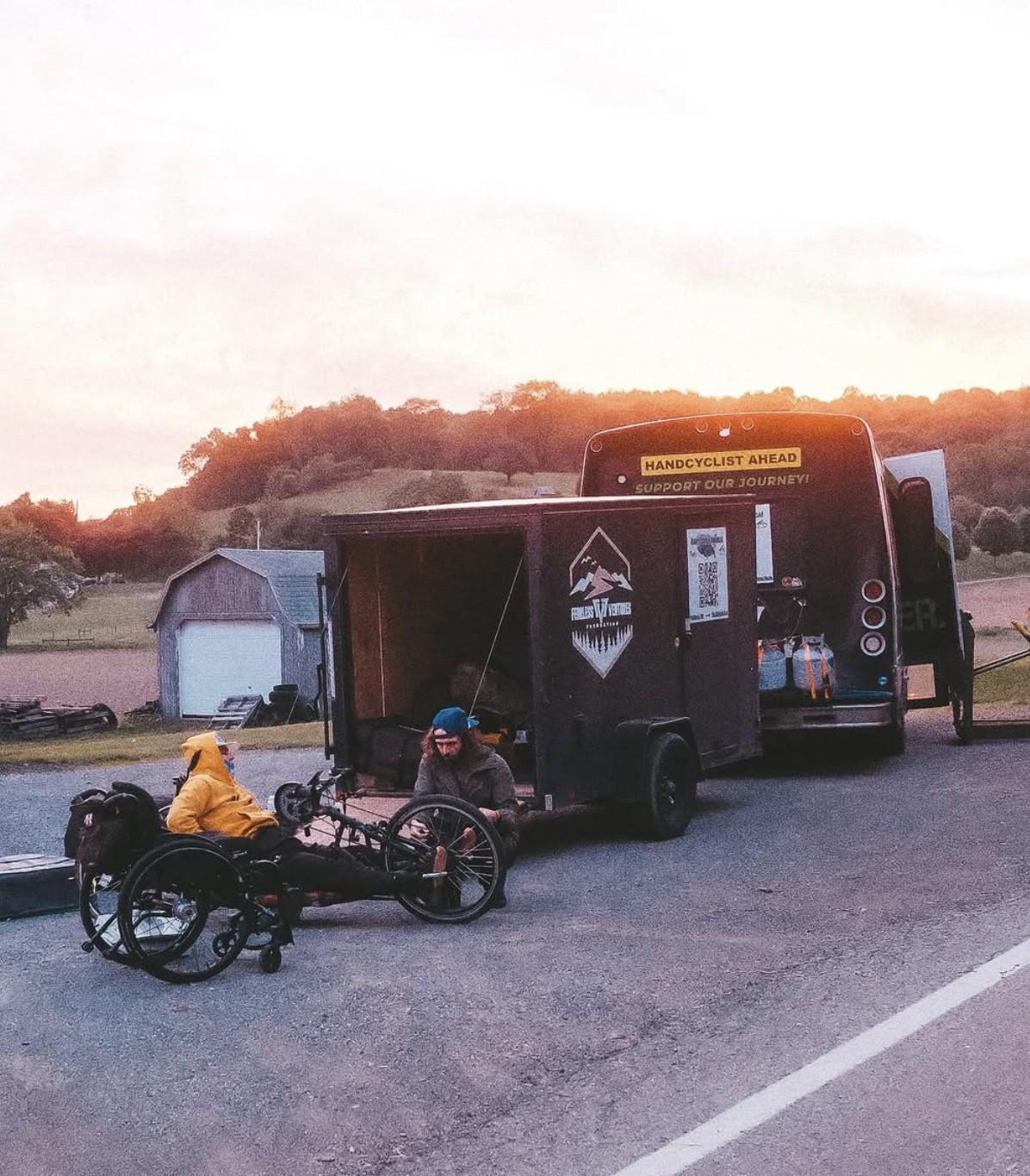
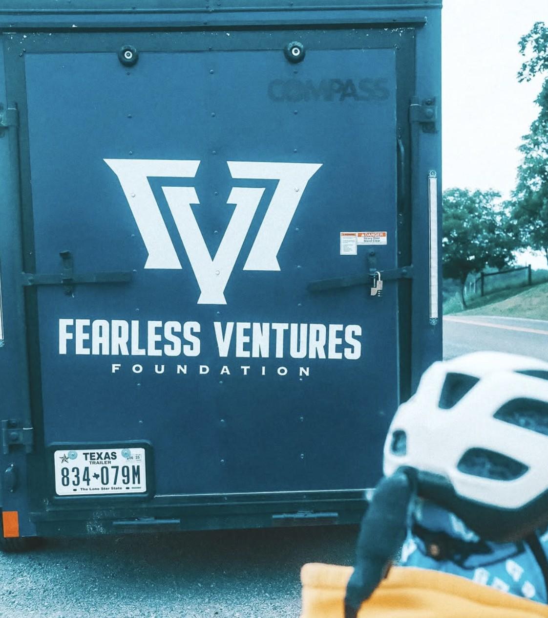
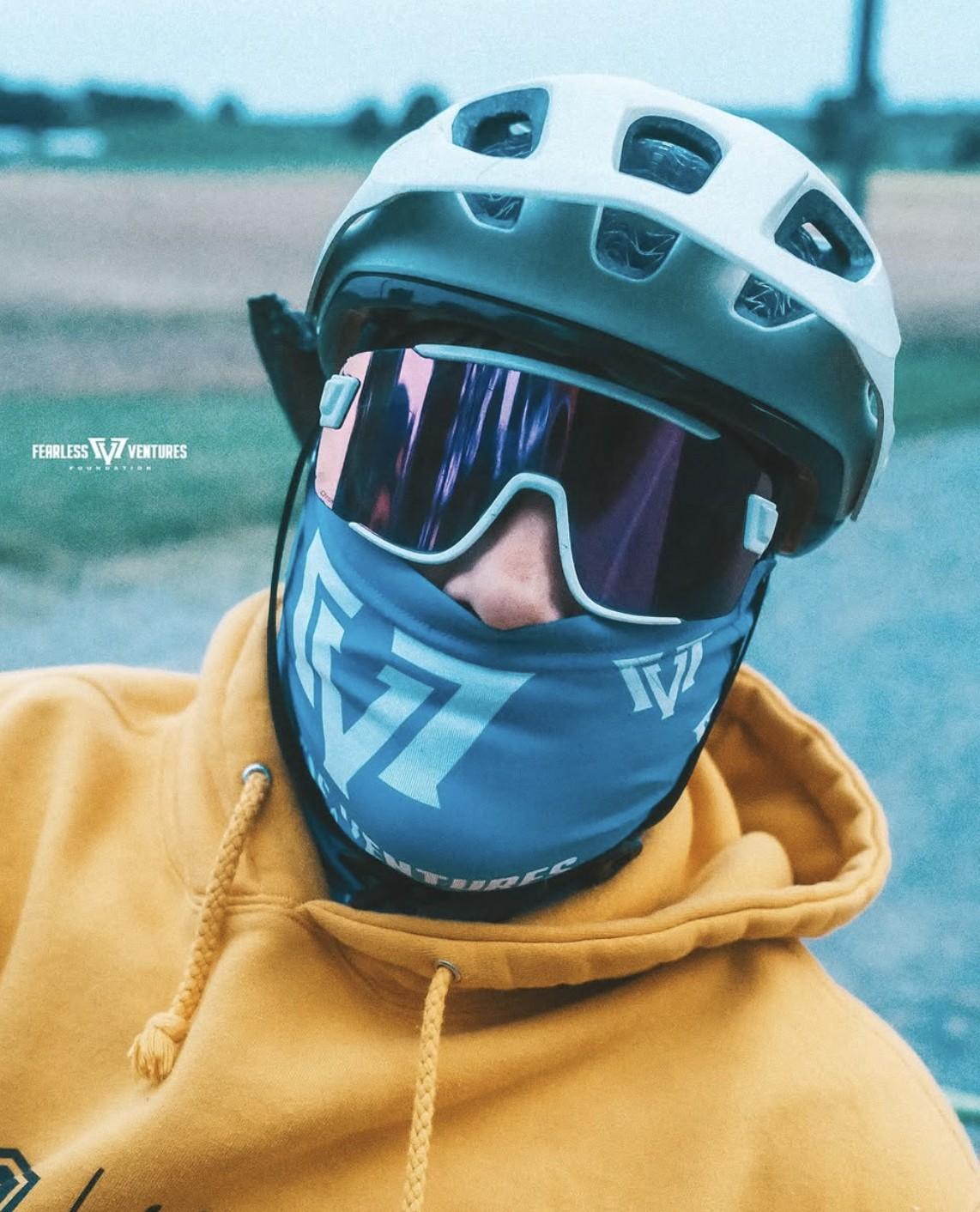
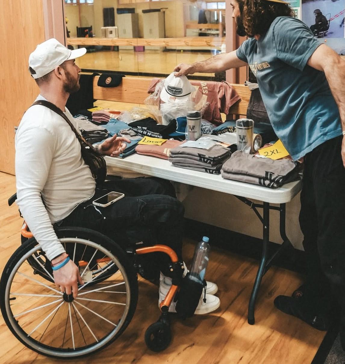
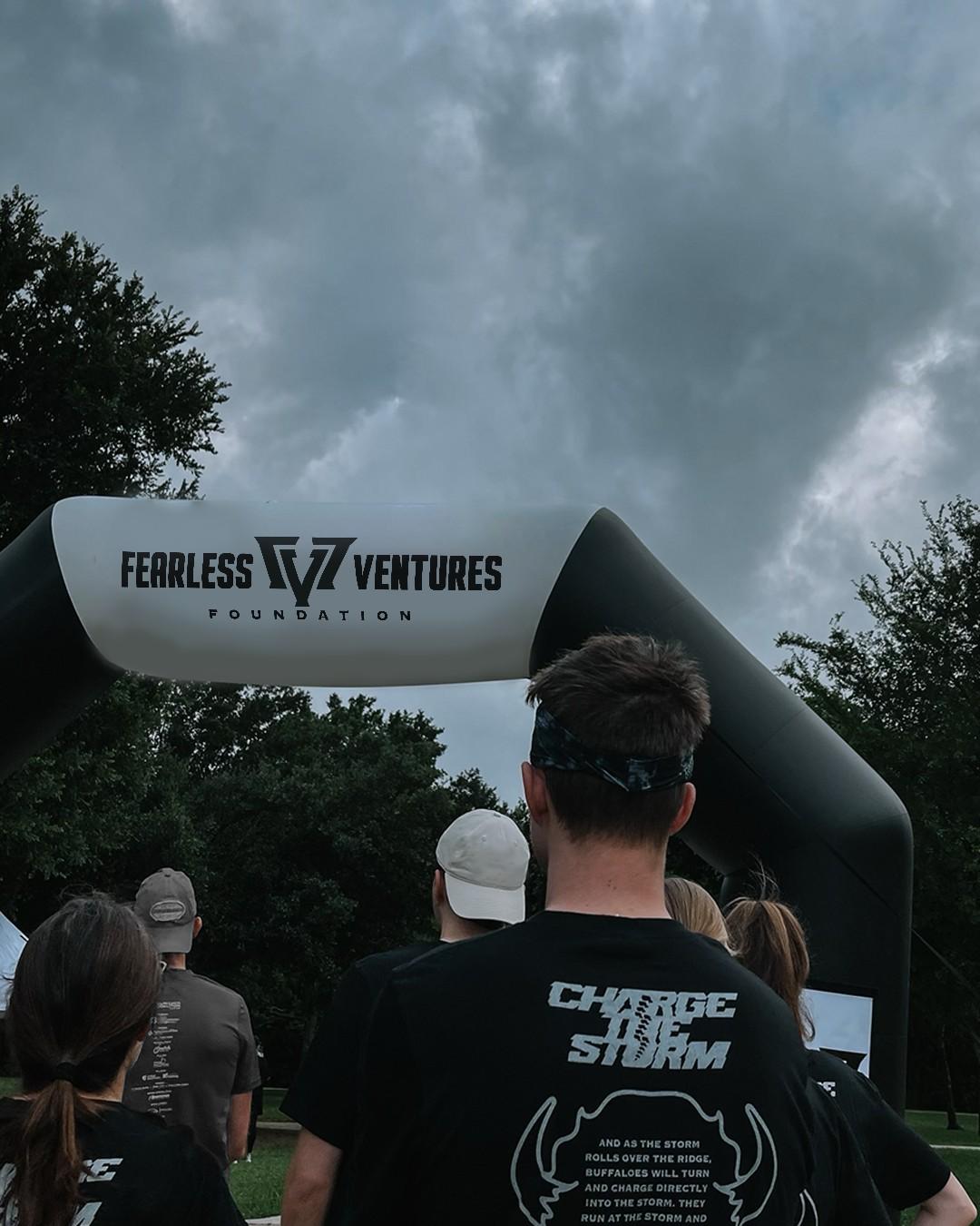
The new logo out in the world: on the foundation's trailer and bus, on the gear its athletes wear to programs and events, and on its posters.
The outcome
A mark with the strength the foundation stands for, now on its trailer, its bus, the gear its athletes wear, its fundraisers, and its website. Rebrands like this are about making an organization look as determined as it already is.