
Origin of Greatness
A hand-drawn logo rebuilt into a full brand system, packaging line, and website for a natural body care company.
- ForClient
- Origin of Greatness
- Role
- Brand & Visual Designer
- Year
- 2021 to present
- Result
- From 4 launch products to a full line, all on one system
- Scope
The brief
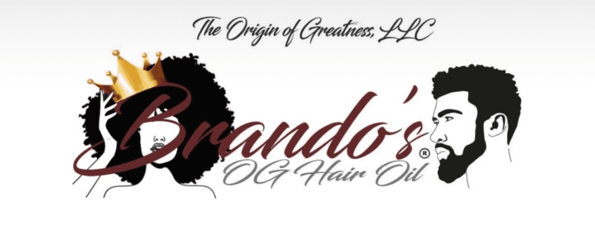
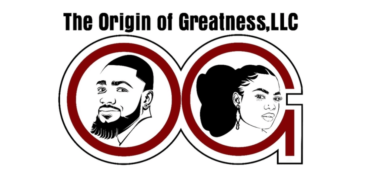
Origin of Greatness makes all-natural hair and body care for Black consumers. Its founder, Brandon Hunter, is a biochemist who first made the formula for his mother. It started as Brando's OG Hair Oil, and its first two logos were detailed illustrations that got lost at label size and only spoke to one product. He came to me for a brand update.
The approach
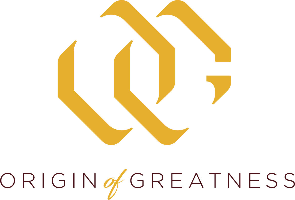
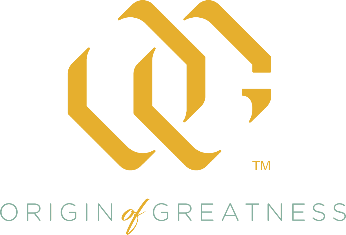
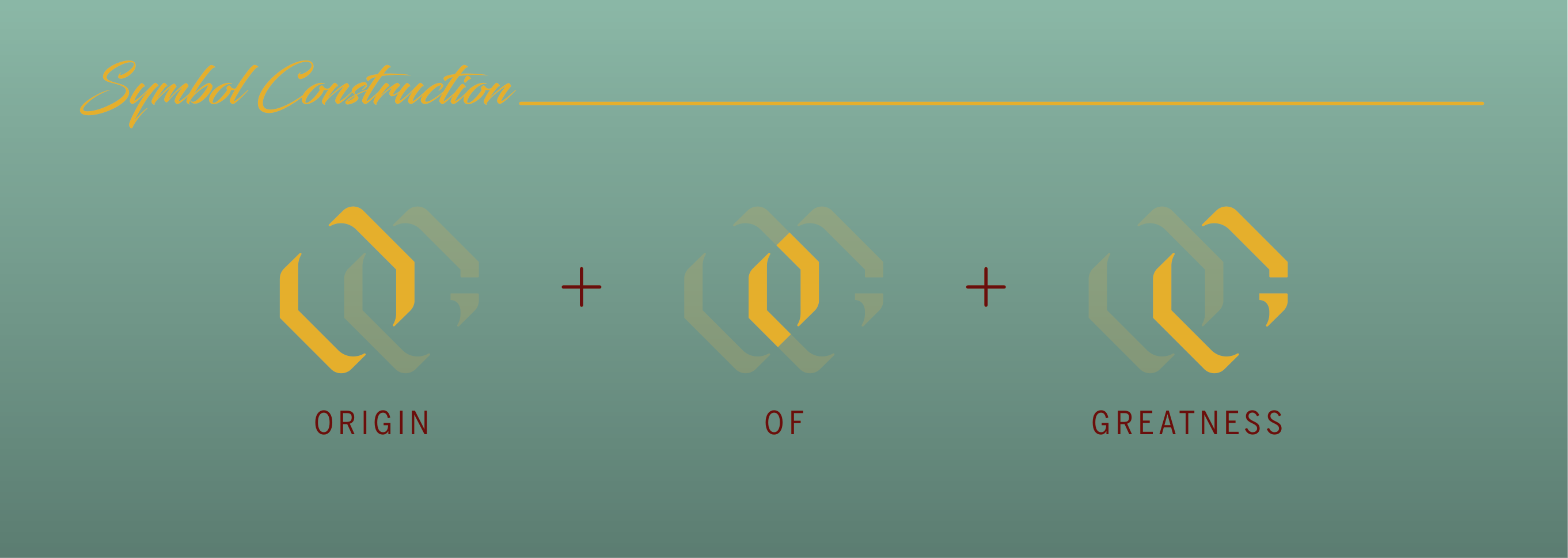
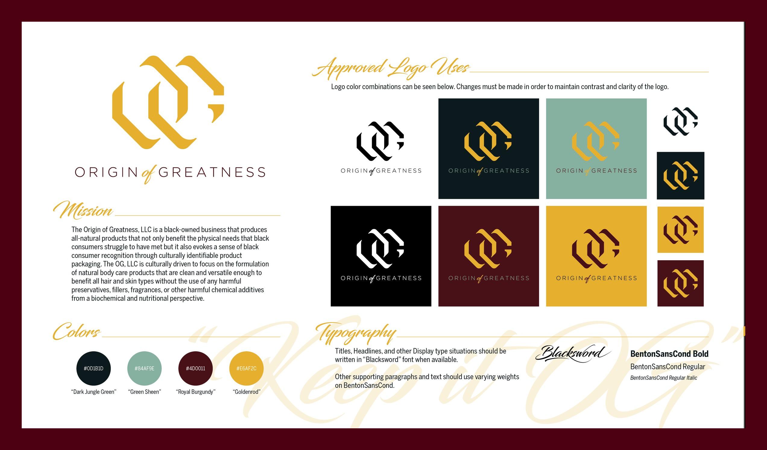
I rebuilt the identity around a monogram that spells the whole name: an O for Origin, a center stroke for of, and a G for Greatness. The letters link like a chain, a symbol of strength, and the outline nods to the hexagon of chemistry diagrams, a tip of the hat to the founder's background in biochemistry. Four colors, a script for display type, and a clean condensed sans for everything else. It holds up from a 1oz bottle label to a storefront.
Where it started
The original logo and the second version, both made before I came on.
The new identity
A monogram that spells the whole name and links like a chain, shaped like the hexagons of chemistry for a founder trained in biochemistry. Set in burgundy and gold, with a Keep It OG script for the brand's voice.
Packaging
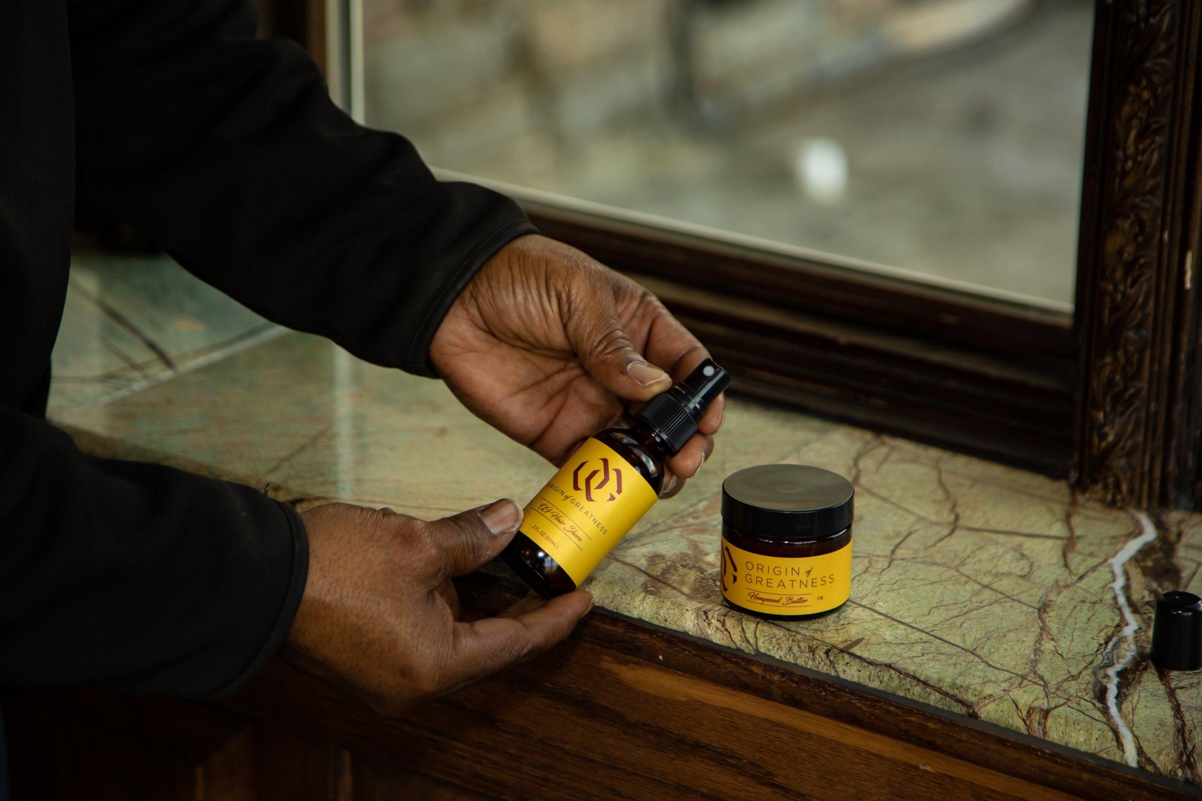
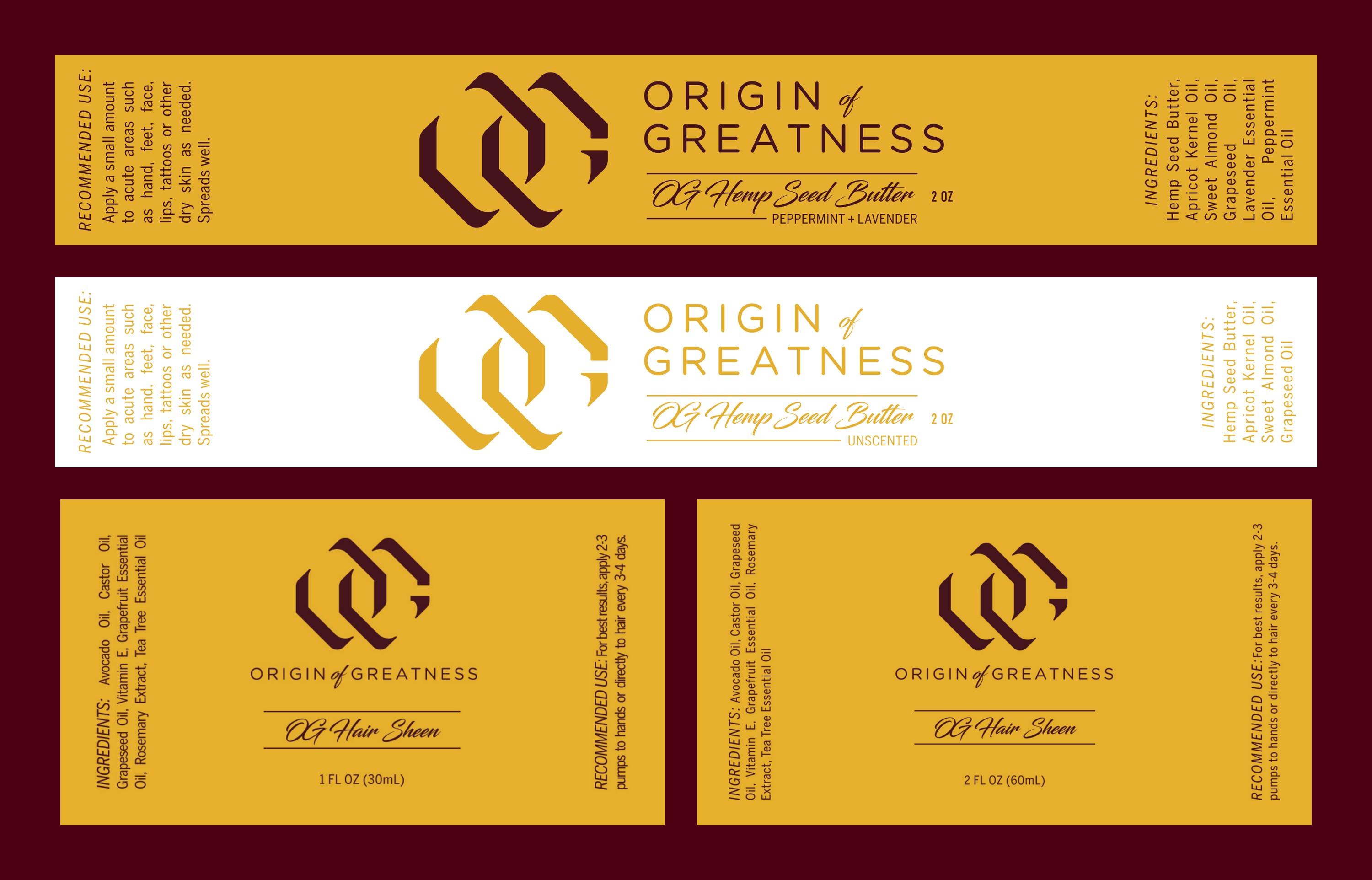
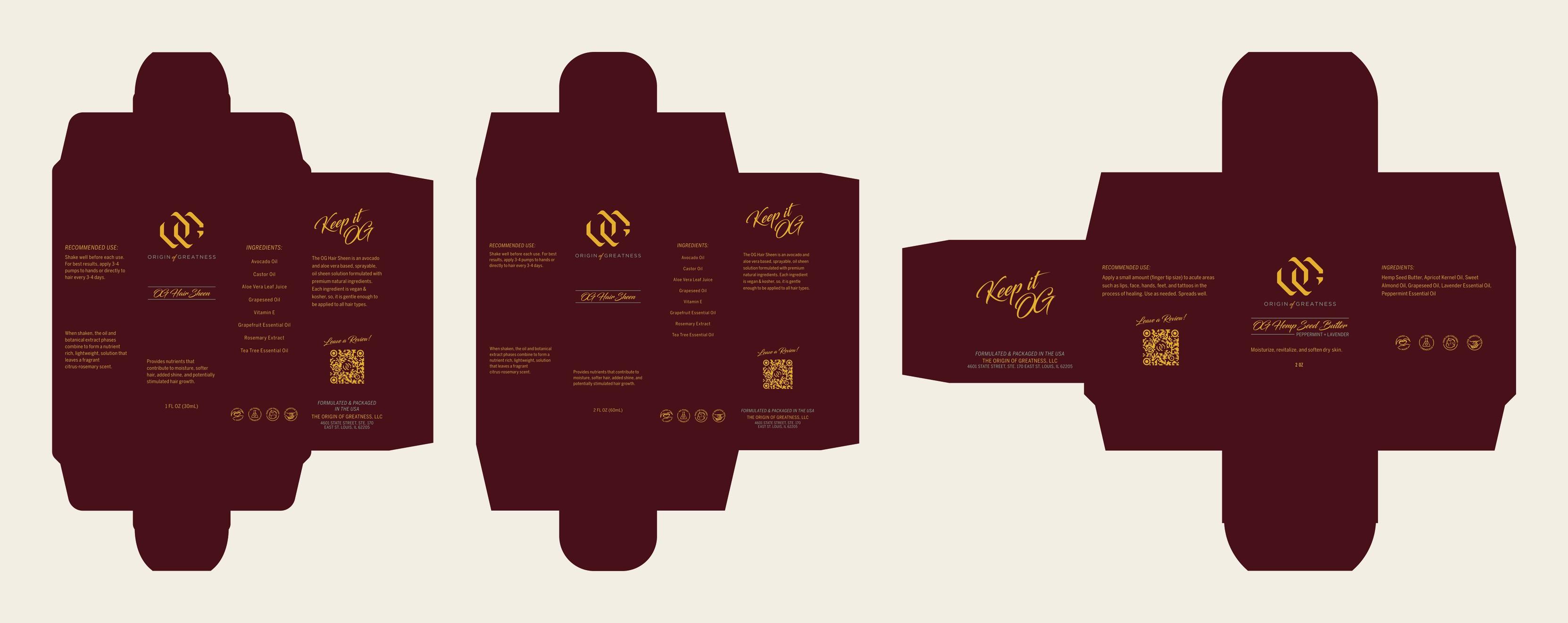
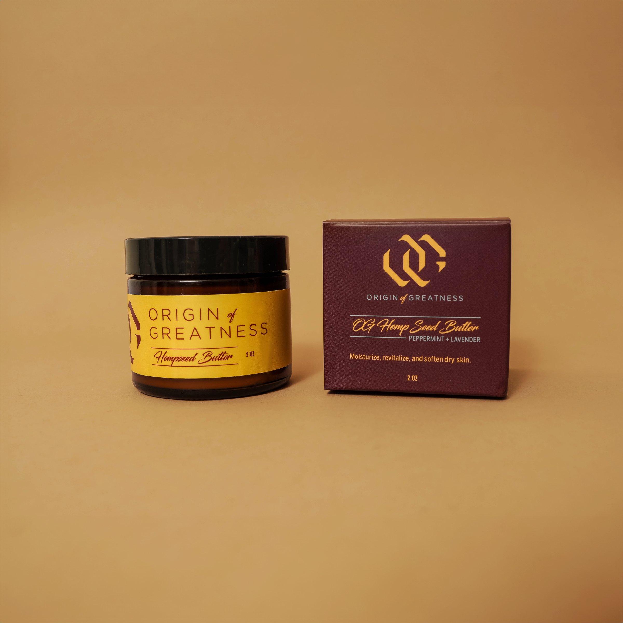
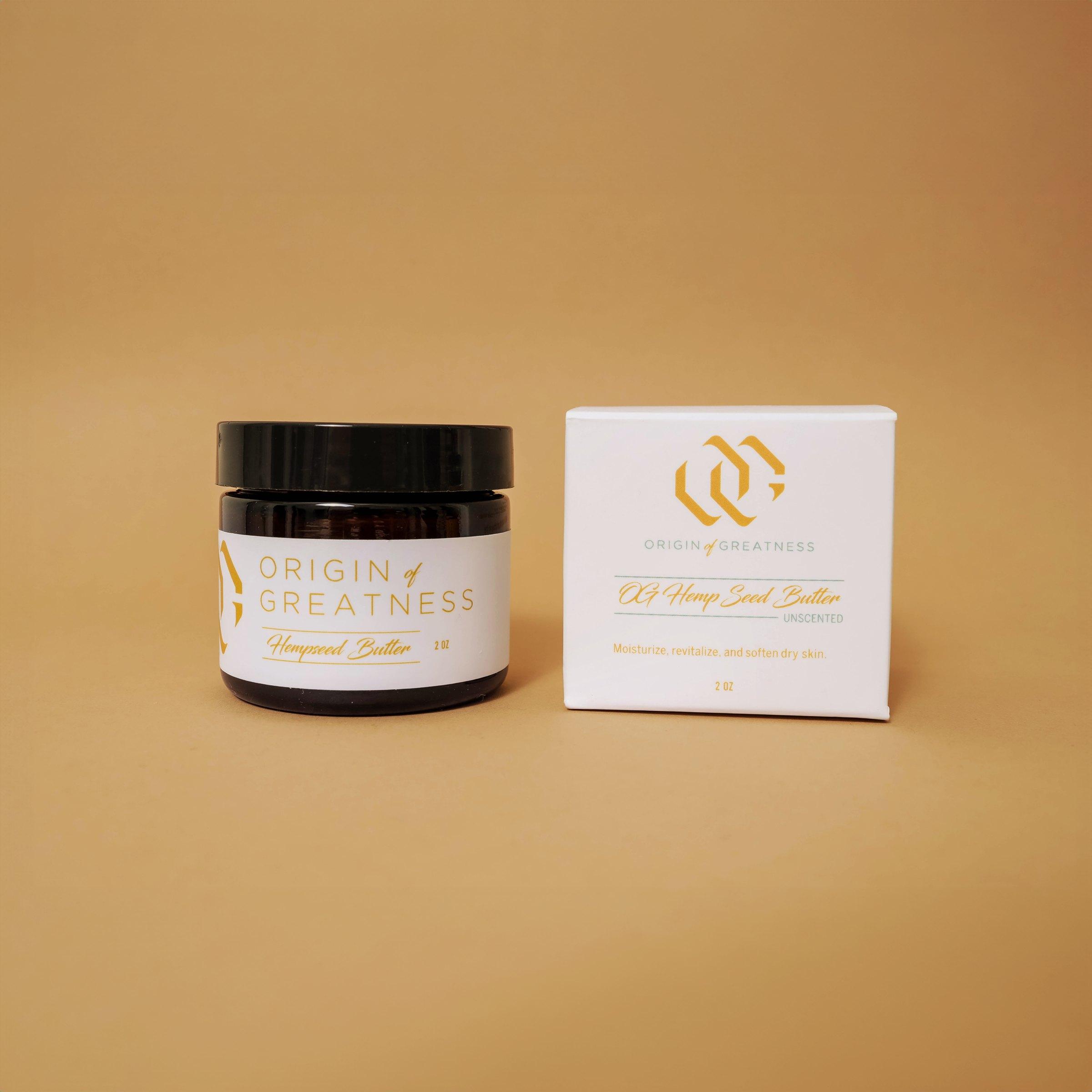
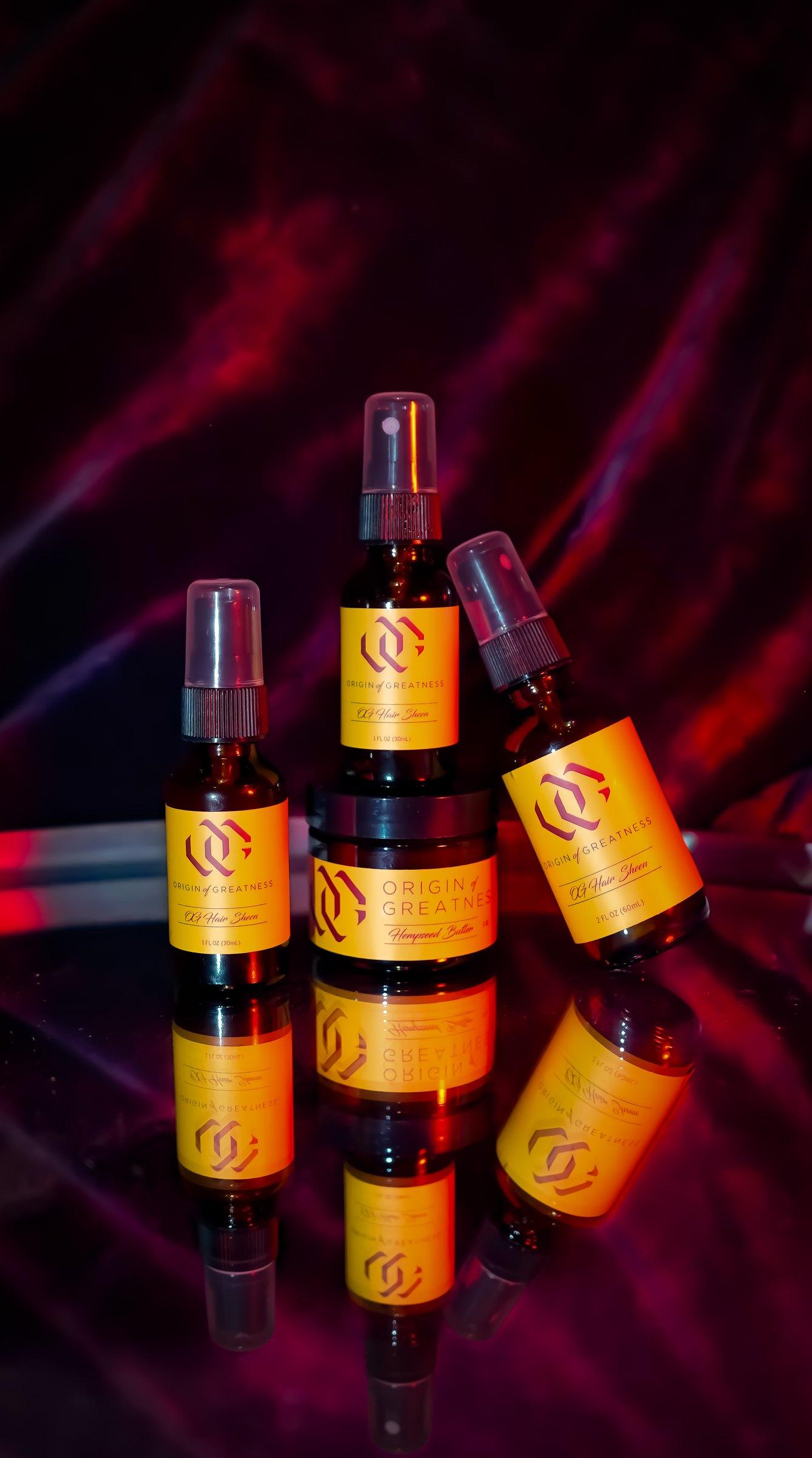
One label system across the line: hair serum in two sizes and hempseed butter in scented and unscented. Gold labels for the core line, white for unscented, and boxes in burgundy and white to match.
Website
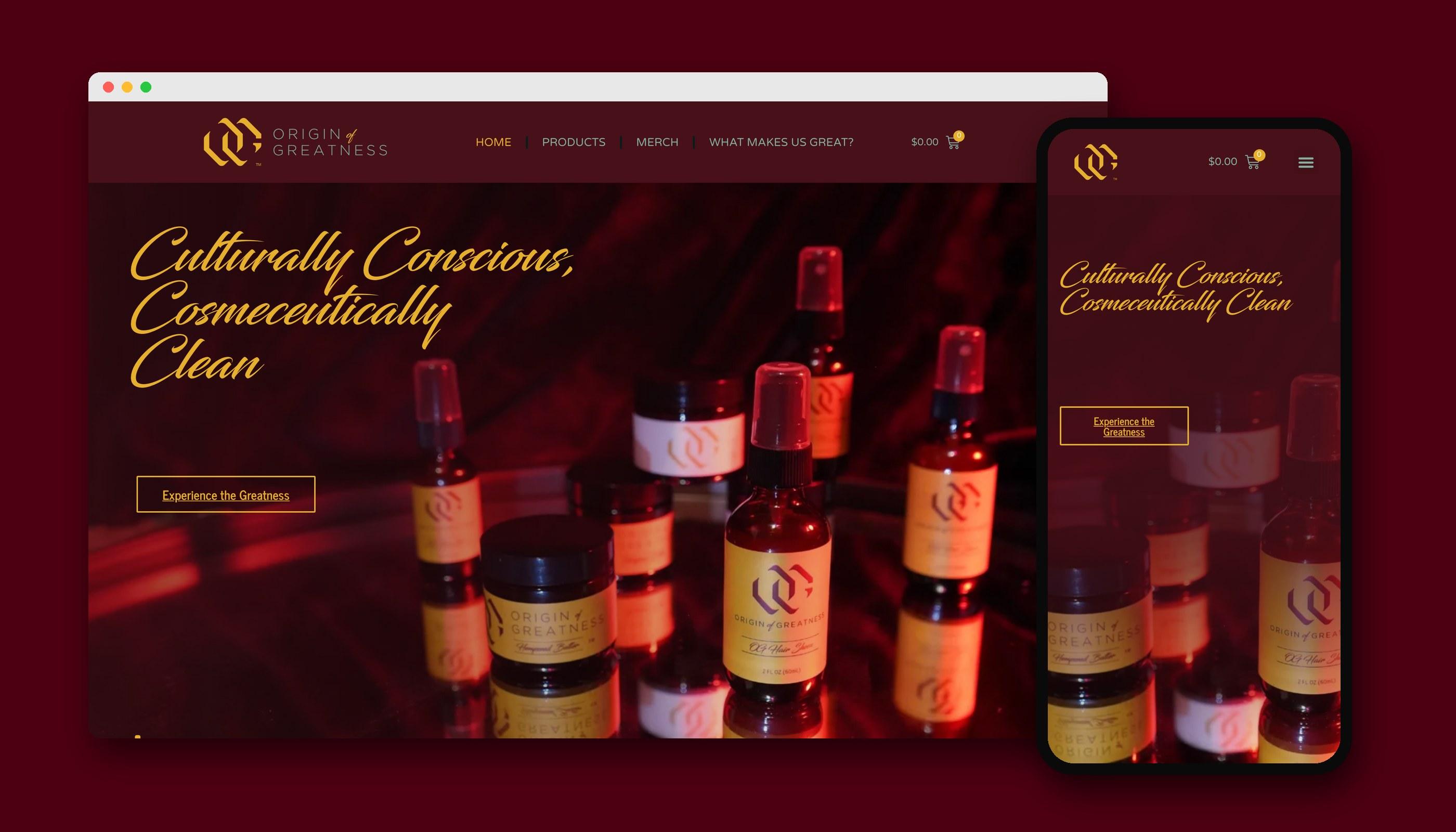
I designed theog.net to carry the brand online: the script headline, the burgundy and gold, and the product photography up front, with a shop that works as well on a phone as on a desktop.

In use
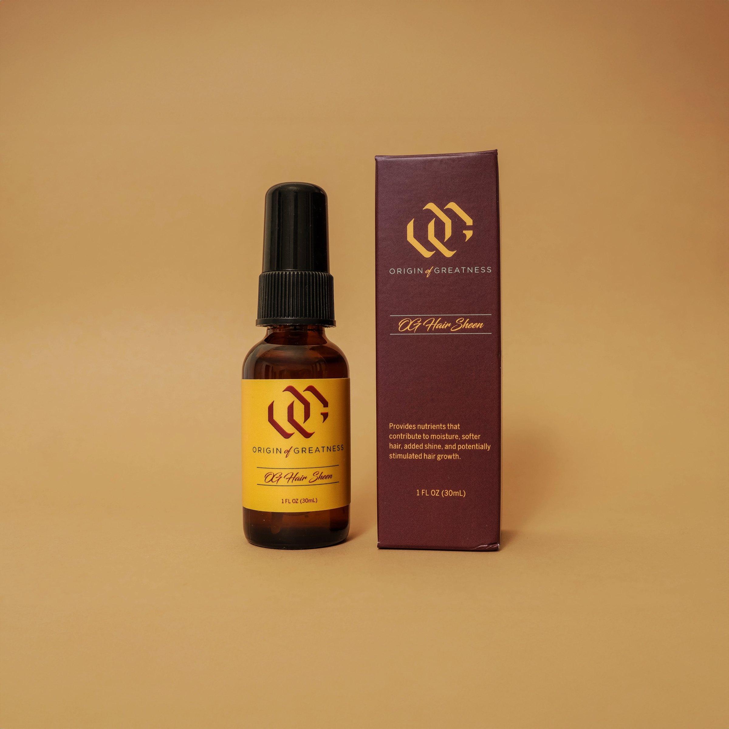
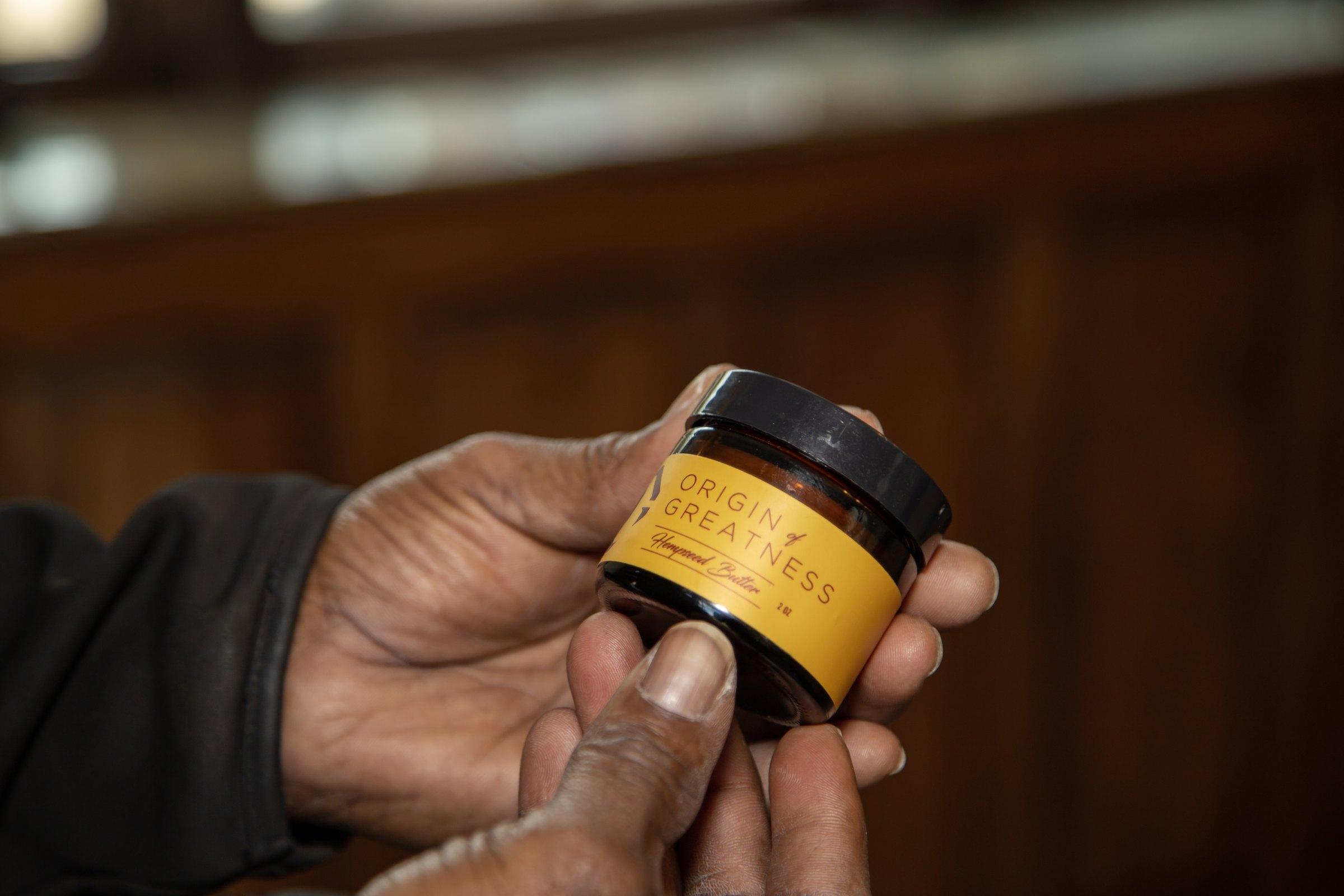
The brand on the shelf and in people's hands, from the hempseed butter to the full product lineup.
The outcome
The brand went from a hand-drawn logo to a complete system the client can put on any product, size, or surface. It launched with four products: a 1oz and 2oz hair sheen and a scented and unscented hempseed butter. The line has since grown into hempseed butters in new scents, bath magnesium flakes, herbal teas, and more, all on the same system. The logo update grew into an ongoing role: I now manage the brand across packaging, labels, and web.